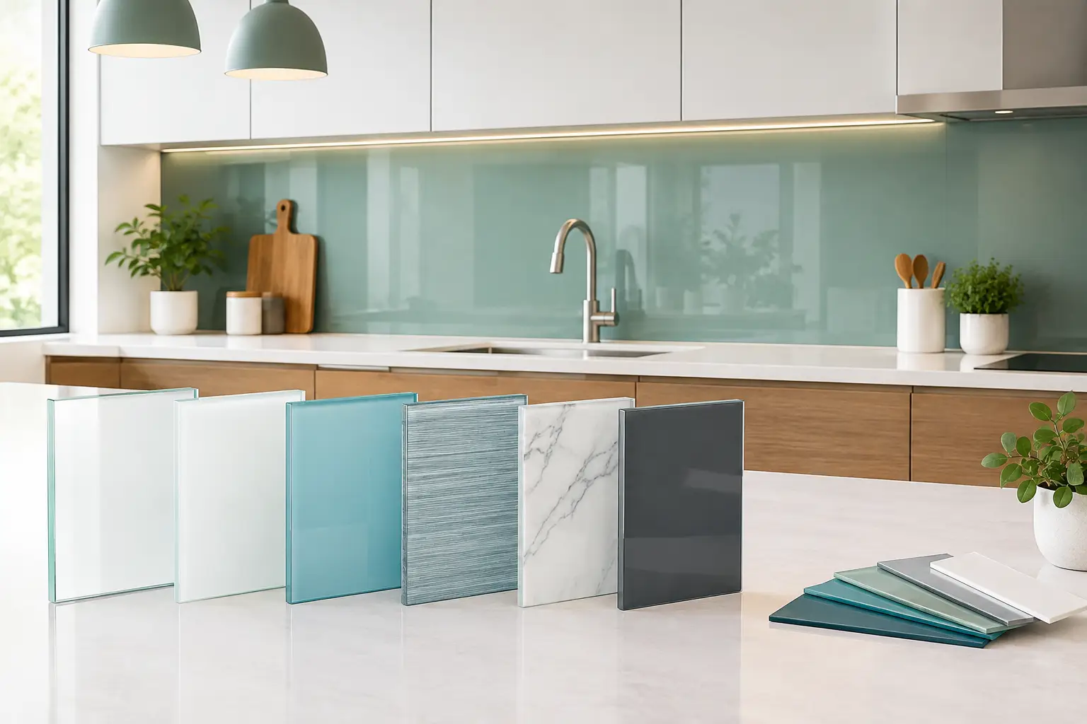
A glass backsplash can do more than protect the wall behind a range or bar. It can carry color across the room, reflect the character of a countertop, and give a tailored kitchen a clean, architectural finish. Knowing how to select glass backsplash material starts with a simple question: should the backsplash quietly support the room, or become one of its defining surfaces?
For a custom project, the answer is rarely found in a single sample viewed on its own. Glass changes with light, surrounding finishes, panel size, and the color placed behind it. The best choice considers all of those elements together, then balances visual impact with the way the space will be used every day.
Start With the Role of the Backsplash
Before choosing a color or finish, decide what the backsplash needs to do in the composition. In a kitchen with dramatic veining, figured wood cabinetry, or an expressive metal range hood, a restrained glass surface can provide welcome visual calm. A soft white, warm gray, deep neutral, or pale translucent tone may give those materials room to stand out.
If the cabinetry and counters are intentionally understated, glass can become the focal point. Saturated blue-green, ink, ruby, or black glass brings depth without introducing the grout lines associated with tile. This approach is particularly effective behind a bar, where reflected light and a continuous plane of color create a more polished, hospitality-inspired atmosphere.
The goal is cohesion, not a perfect color match. A backsplash that matches the countertop too closely can flatten the room. Instead, look for a relationship in undertone, sheen, or contrast. A cool gray counter may pair beautifully with smoky blue glass, while warm walnut cabinetry can be elevated by olive, bronze, cream, or charcoal tones.
How to Select Glass Backsplash Color and Light
Glass is highly responsive to its surroundings. A sample that appears crisp and bright in a showroom can read differently in a north-facing kitchen, beneath warm under-cabinet lighting, or beside a large window. Review samples with the actual cabinet, countertop, hardware, and paint selections whenever possible.
Natural light deserves special attention. Clear and translucent glass can feel luminous in a sunlit room, but its degree of transparency may reveal more of the surface behind it than expected. Back-painted glass produces more consistent color and is often the right choice when a clean, uninterrupted field is the priority. Opaque glass also works well when you want the color to hold its own from morning through evening.
Consider artificial lighting as carefully as daylight. Warm LEDs tend to soften white and cream glass and enrich amber, bronze, and green hues. Cooler lighting can make blue, gray, and bright white surfaces feel more contemporary, though it may make warm finishes appear less inviting. If your kitchen has layered lighting, look at the sample under each setting before committing.
Reflectivity is another design decision. Glossy glass bounces light around the room and can make a compact kitchen feel larger. It also reflects pendant fixtures, window views, and countertop accessories, which can be either an asset or a distraction. A softer or more textural specialty glass reduces sharp reflections while retaining the material’s depth and distinctive character.
Choose a Glass Style That Fits the Architecture
A single large glass panel has a distinctly different presence from smaller, divided sections. Broad panels feel sleek and contemporary, with fewer visual interruptions. They are especially compelling in kitchens with long countertop runs, clean-lined cabinetry, and sculptural focal points such as custom metal hoods.
Smaller panels can make more sense when the wall is broken up by windows, shelves, or cabinetry. They offer flexibility around architectural details and can introduce a more deliberate rhythm. The right scale depends on the room: an expansive, open kitchen can carry a dramatic uninterrupted panel, while a compact but detailed space may benefit from carefully proportioned sections.
The edge treatment matters, too. Exposed polished edges create a refined, jewel-like detail in locations where the perimeter remains visible. In other applications, the glass may be designed to meet surrounding elements with a quieter, more integrated appearance. These are small decisions, but they distinguish a made-to-order surface from a standard decorative product.
For a more layered effect, consider specialty glass with movement, texture, metallic character, or subtle variation. This is an excellent way to add interest without relying on a loud pattern. In a bar or restaurant setting, textured or artisan glass can catch ambient light and create a memorable backdrop that still feels enduring.
Balance Beauty With Daily Care
Glass is naturally nonporous, making it a practical surface for areas exposed to splashes, cooking residue, and frequent cleaning. A smooth panel does not have grout joints to collect residue, and routine care is generally straightforward with a soft cloth and a nonabrasive cleaner suitable for glass.
That said, finish selection affects what you see day to day. Dark glossy glass can show water spots, fingerprints, and streaks more readily than a lighter or less reflective surface. This does not make it a poor choice, but it is worth choosing with clear expectations. In a busy family kitchen, a medium tone, subtle texture, or lower-reflection finish may be more forgiving.
Think about the backsplash’s proximity to high-heat areas as well. The exact glass specification should be selected for the application and project conditions. A custom fabricator can help align the chosen color, finish, thickness, and performance requirements with the intended use, whether the piece is for a residential kitchen, beverage station, restaurant bar, or decorative wall.
Coordinate Glass With Countertops and Metals
Glass has a useful ability to bridge materials that might otherwise compete. It can cool down richly grained wood, brighten dark metal, or add a clean contrast to substantial concrete and stone-look counters. The most successful pairings acknowledge the personality of each surface rather than forcing everything into the same finish family.
With wide-plank wood or butcher block, glass often provides a crisp counterpoint. Warm white, muted sage, smoky gray, and deep navy can all work, depending on the wood’s undertones and the room’s lighting. A lightly reflective finish can also bring brightness to a kitchen centered on natural materials.
With zinc, bronze, copper, pewter, or stainless steel, consider whether you want harmony or contrast. A softly toned glass can echo the patina and depth of artisan metal. Alternatively, a pure white or near-black panel creates a more graphic look, allowing the metal’s hand-crafted variation to take center stage.
Do not overlook hardware. Brushed brass, blackened steel, chrome, and nickel may occupy only a small portion of the room, but they influence how a glass color reads. Bring those finish samples into the selection process early, especially if the backsplash will sit near a range hood, open shelving, or a bar rail.
Make Custom Details Part of the Selection
A custom glass backsplash is an opportunity to design for the actual wall, not an average kitchen. Consider where the visible edges will fall, how high the glass should rise, whether it should continue behind open shelving, and how it will relate to nearby wall panels or decorative components. A backsplash that stops at a natural cabinet line may feel intentional; one that extends to the ceiling can create a more dramatic architectural statement.
Color can also be made to your exact design direction rather than limited to a narrow set of stock options. This matters when the glass needs to complement a distinctive countertop, a one-of-a-kind hood, or a carefully developed palette for a hospitality project. Requesting material samples early gives the full scheme time to develop with confidence.
Brooks Custom brings nearly five decades of surface expertise to these conversations, helping clients weigh the visual and practical qualities of specialty materials before fabrication begins. The result should feel personal to the project, built around the details that will still matter after the renovation is complete.
A well-chosen glass backsplash does not need to compete for attention. It should make the surrounding materials look more intentional, catch the light in a way that suits the room, and give the space a finish that feels distinctly your own.